I have recently adopted a mobile first approach to web site design and development and its been a complete shift in the way I think about layout and content. I have always been a desktop first design advocate and I must say, mobile-first does make sense in today's tech environment.
At the beginning I was a critic of the mobile-first trend, I believed we should include ALL elements in our designs and scale down as needed. However, a mobile first approach forces us to do the opposite and it makes sense since most traffic now derives from mobile devices, so these devices should have the first say.
The rise of mobile
Website owners (including myself) have seen a steady and relentless rise in mobile traffic, so the way we deliver web experiences had to adapt to this change. This website and everything I do here on is an example of this.
I have been delivering optimised experiences for smaller screens for awhile now, using the desktop-first approach, which works but it's not the fastest for mobile devices. I do a lot of UI/UX work and the move to mobile first as been most revealing and one of the most exciting moves of the year for me.
Remember Graceful Degradation? That was then, the new now is; Progressive Enhancement. Mobile first is progressive enhancement at it's best.
HTML5 and CSS3 helped greatly in the transition to mobile-first. I never liked the idea of using JavaScript to detect the device type, either by analysing the UserAgent or screen size, that for me was off-putting and with the advent of media-queries I had all the pieces needed to finally jump ship.
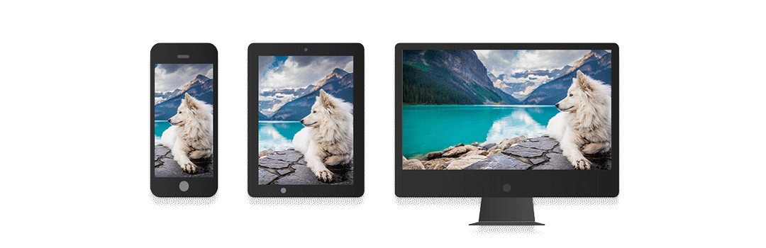
Responsive Design is not equal to Mobile First Design
Just to get things clear, responsive design is not the same as mobile first design. Responsive design should always be present no matter what and it's a great complement to the mobile first approach. On one hand, your design adjusts to the consumer view port size, on the other, it only serves assets on platforms that are better suited to show them. This makes mobile-first faster and appear snappier on low end devices.
Mobile first is innovation by design, its a paradigm shift and right now it's a requirement, a must, not a good to have, it requires slight changes to the way we design, plan and deliver content, so if you are still not on-board, I invite you to have a go at it. It pays off, it really does.
Behaviour and user interaction is perhaps the most important of all considerations. I tend to make buttons or clickable areas slightly bigger to accommodate and facilitate clicks with a finger on smaller screens, all this has to be tested across a multitude of devices, new and old, but when done right it pays off, you'll see in the stats, the numbers should reveal a healthy count and everyone should be happy, users and business owners.
Mobile-first however, proves challenging for content producers and one must ask if content has to be adjusted also for the different devices? After all, writing is designing, but I'll leave the question open and for the time being I will focus only on design considerations and let the content auto-fit.
On my future mobile first projects, I will explore how content can also benefit from this approach beyond size and copy length.
Let me know what you think?